How LED Light Color Affects Liquor Display Racks
In liquor retail, rack design alone does not sell the product. Lighting plays an equally powerful role. Many store owners invest heavily in display fixtures, branding panels and bottle arrangements but ignore one critical factor: light color temperature.
Light color is not simply "white" or "yellow". It is technically measured in Kelvin (K).
- 3000K – Warm Yellow Light
- 4000K – Neutral White
- 6000K – Cool Daylight White
Selecting the right temperature can completely transform how a bottle looks how premium it feels and how customers perceive the brand.
Understanding Light Temperature in Liquor Display 3000K – Warm Yellow Light
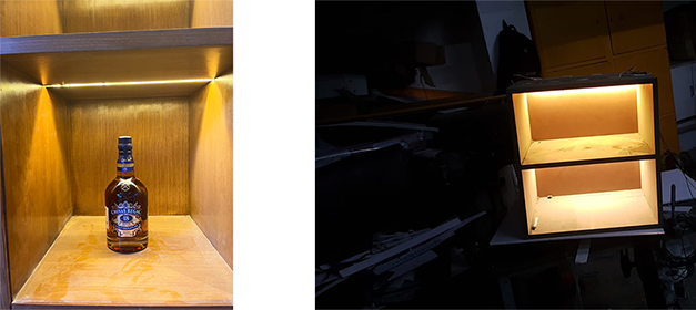
Warm light creates a rich and premium environment. Whiskey bottles appear warmer and more luxurious under 3000K lighting.
Suitable for:- Premium whiskey brands
- Luxury segments
- Wooden or dark toned racks
- Highlight display sections
Balanced and clean. It is neither too warm nor too cool. It maintains clarity while still offering warmth.
Suitable for:- Mid premium brands
- Multi brand liquor outlets
- Modern retail interiors
Very bright and sharp for many years, this was the default choice in liquor racks.
Suitable for:- Fast selling brands
- Budget segments
- Supermarket style display
However, brightness alone does not define premium positioning.
Light color is a brand statementLight temperature is not just a technical selection it defines brand positioning.
- Warm light = Premium & Luxury
- Neutral light = Modern & Clean
- Cool light = Mass & Fast moving
In many cases, brand agencies define lighting tone as part of brand guidelines. It becomes part of the identity, just like logo color or typography.
For smaller stores or new brands entering the market, it is practical to study established premium outlets and align lighting tone accordingly.
Factors That Affect Light Color Selection
Light cannot be selected randomly It depends on:- Background wall color
- Rack surface finish (wood, matte, gloss, metal)
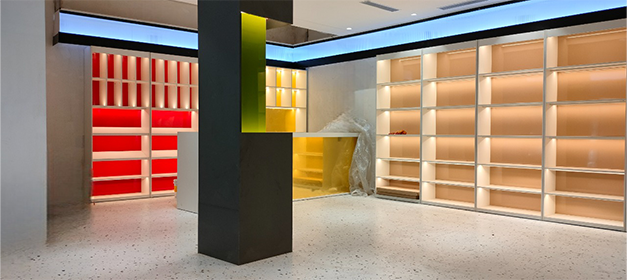
- Backlit or front acrylic illumination
- Acrylic color (milky, clear, tinted)
- Viewing distance
- Bottle color and label finish
- Product segment (fast selling / premium / luxury)
- Gold mirror background + 6000K = strong glare
- Dark wooden rack + 3000K = premium depth
- White acrylic + 3000K = slightly yellow tone
Technical understanding is required before finalizing.
Viewing Distance and Product Positioning
If customers view racks from:- 5–10 feet distance: A slightly brighter tone helps visibility
- 2–4 feet distance: Warm tones enhance emotional appeal.
Premium products are often examined closely fast selling brands need visibility from a distance.
Lighting must match buying behavior.
How Light Defines Product Premiumness
Lighting directly impacts:- Bottle shine
- Liquid depth
- Label visibility
- Emotional connection
Warm lighting adds richness to dark liquor.
Cool lighting increases clarity but sometimes reduces warmth and depth.
Premium brands generally avoid excessive cool white light because it can make bottles appear flat.
Market Shift in NCR After 2020
Until 2020 most liquor racks in the NCR market were designed with 6000K cool white light.
The common mindset was simple “More brightness means more attraction.”
Bright racks were considered modern and attention grabbing. But over time, retailers started noticing that brightness was improving visibility, not necessarily premium appeal.
After the successful installation of 3000K and 4000K lighting in liquor display racks by Baba Supersign for our clients, the difference became clearly visible on the shop floor. Bottles looked richer, wooden racks appeared deeper and labels gained a refined appearance.
The output created strong visual impact. Other retailers observed the transformation and began adopting similar lighting tones.
Gradually, the trend shifted in the NCR market.
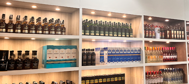
Now many premium liquor outlets prefer warm (3000K) or neutral (4000K) tones to create the following:- Luxury ambience
- Brand differentiation
- Better bottle presentation
- Stronger customer perception
Today, LED light color selection has become an important part of premium liquor store design. It has become a serious discussion point during client meetings especially for premium and luxury liquor segments.
The market moved from “Bright is better” to “Right temperature is better.”
Common Mistakes in Liquor Rack Lighting
- Choosing light based only on brightness
- Mixing multiple temperatures in one rack
- Ignoring reflection from a mirror or glass
- Not considering acrylic color before selecting light
- Overheating due to poor LED planning
Practical Advice for Store Owners
If you are:- Opening a new liquor outlet
- Renovating display racks
- Launching a premium brand
Test two sample shelves one with 3000K and another with 4000K.
Compare physically before finalizing.
You shouldn't make lighting decisions based on what you think will happen.
Final Conclusion
Choosing a light color for liquor display racks is not just a technical step.
It sets the tone for premium perception, brand identity and customer emotion.
A well made rack with the wrong light temperature can make less of an impact. But the right temperature can turn even a simple display into a high end showcase.
In liquor retail, lighting is silent marketing.